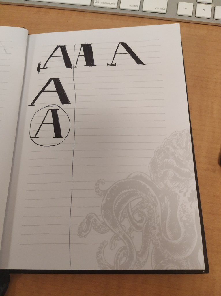
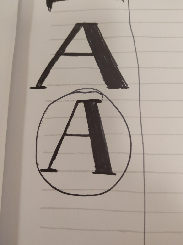
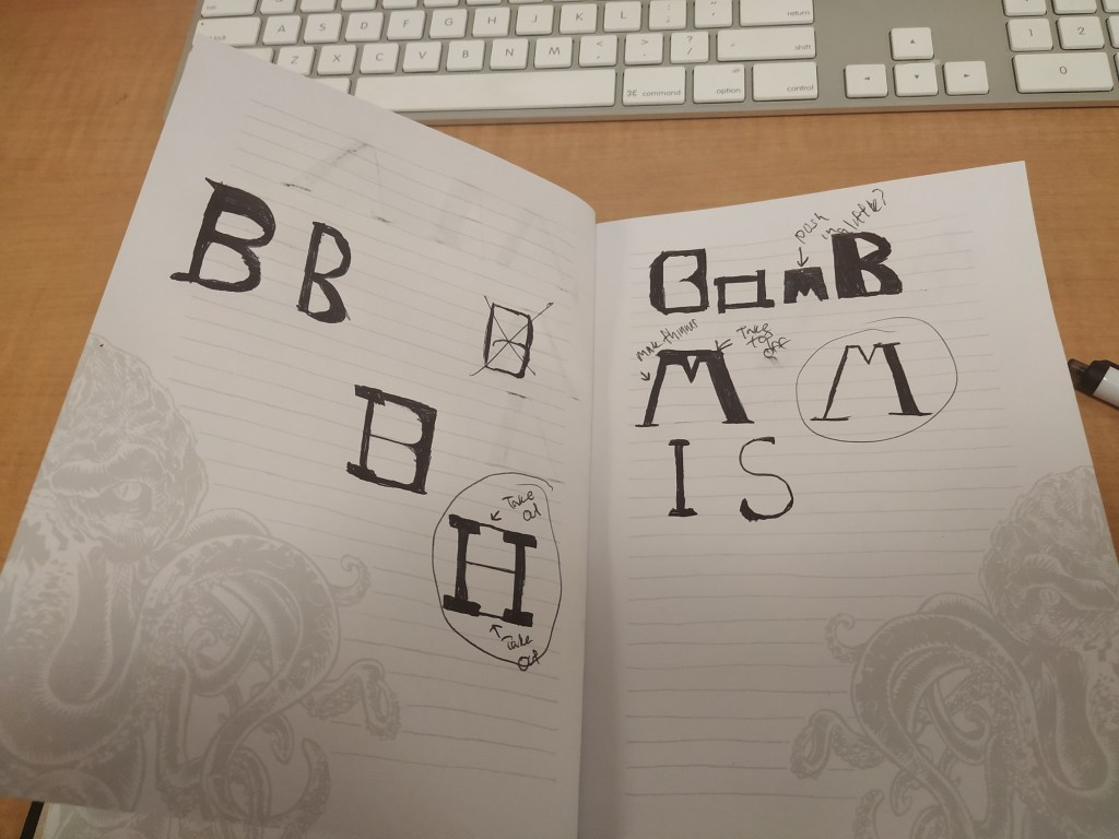
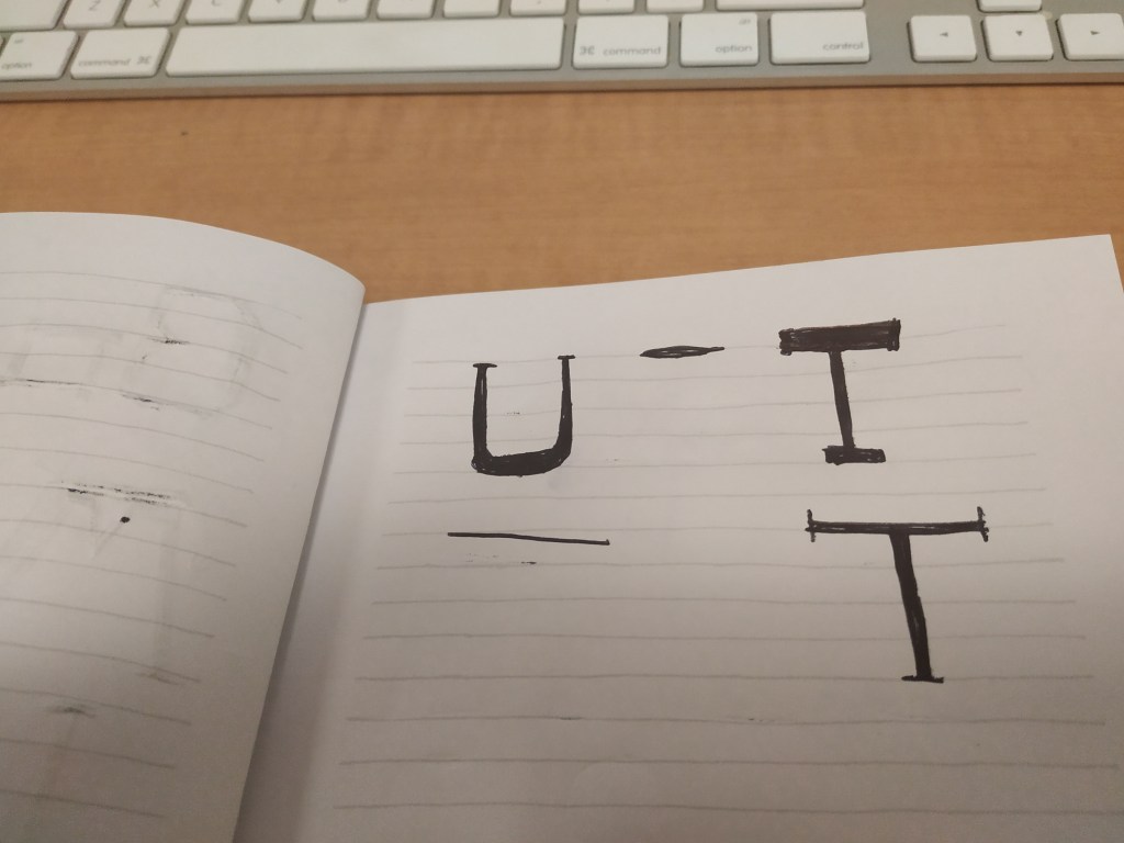
I am starting the typeface and thinking that I wanted something slanted and angled. I am really happy with the “A” that I circled. The ones that I circled are my favorites that I drew up. I accidentally made an “H” when I was trying to make a “B” and I really enjoyed it. I love accidental awesome. I don’t think any of my “B’s” are good. The “U” is okay and I hate the “T’s”
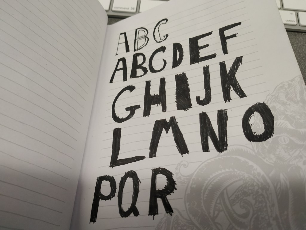
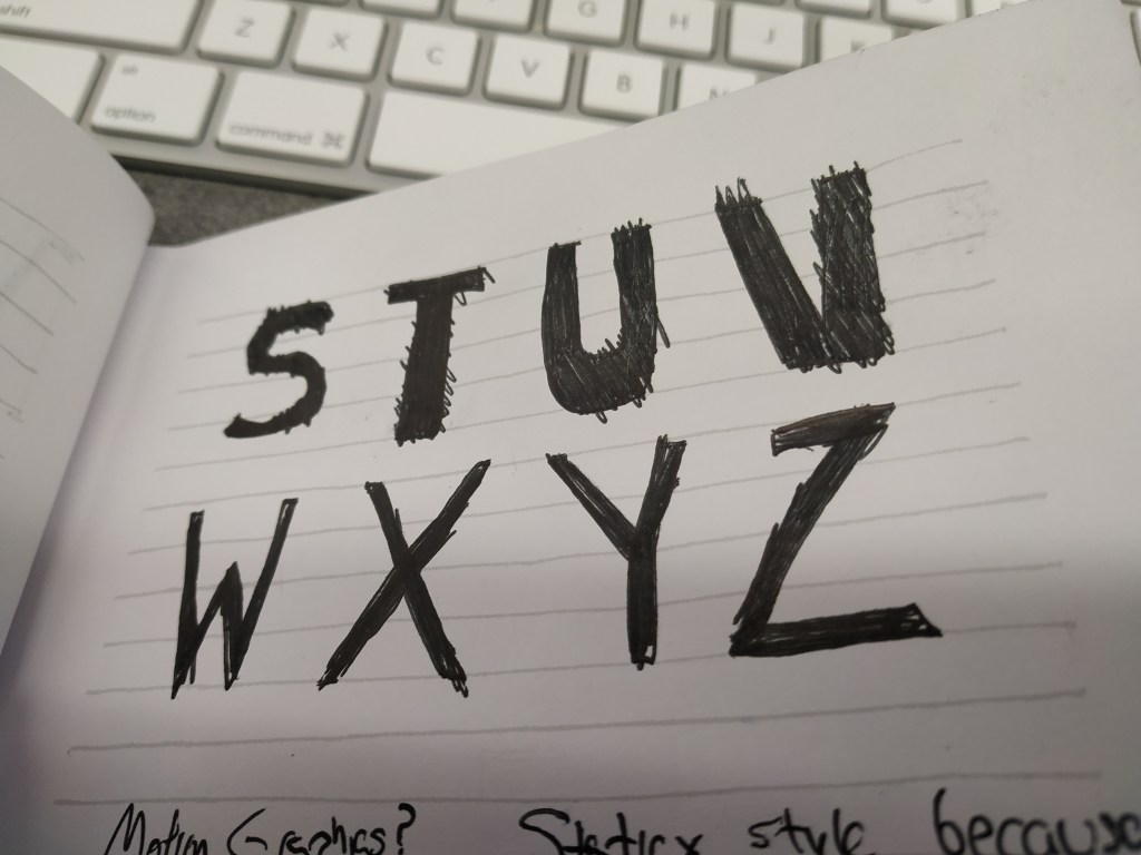
As I was continuing, however, I noticed that my hands were shaking really bad. I noticed that even though there was not a specific rhyme nor reason to the parts that bled out of my letters, the characters had a static like feel to them. I ran with that and drew out the entire alphabet and I am quite happy with it honestly. Here are a couple pictures of the static alphabet.