Hello everyone,
My name is Nick and I chose the Droid typeface family for the cube project. The reason I chose this typeface is because it is the one that the Snapper student newspaper, which I am Opinion editor of, uses for our body copy in the print newspaper.
This is a picture of the prototype draft I made on Adobe Illustrator:
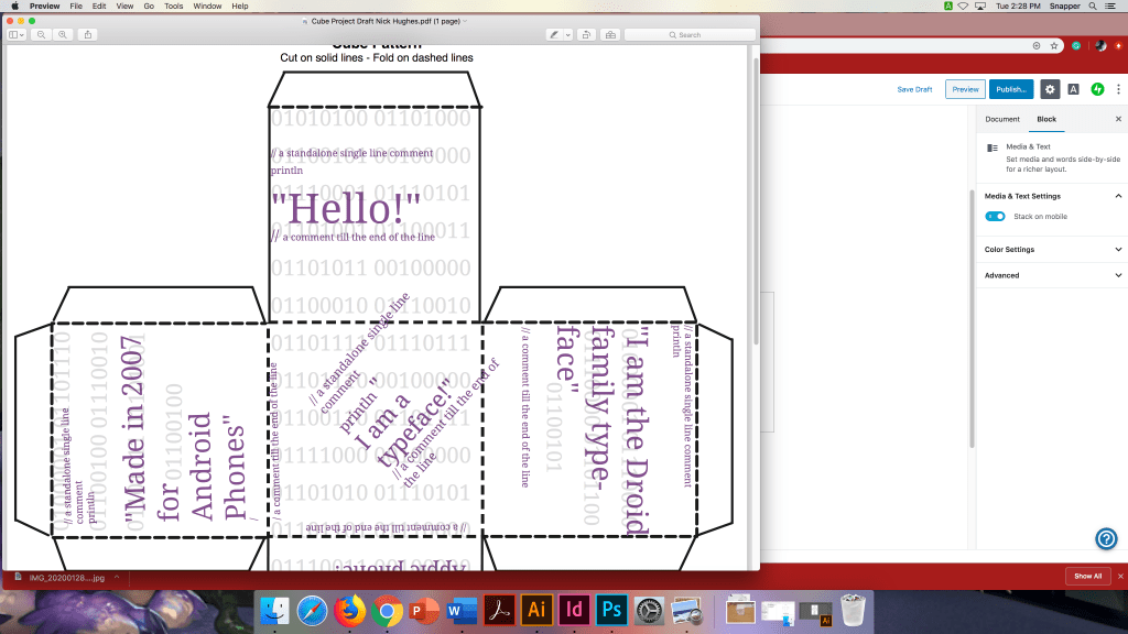
I wanted to make the text purple at first, but I decided to go with black and white for the final piece.
Here is a picture of the prototype cube:
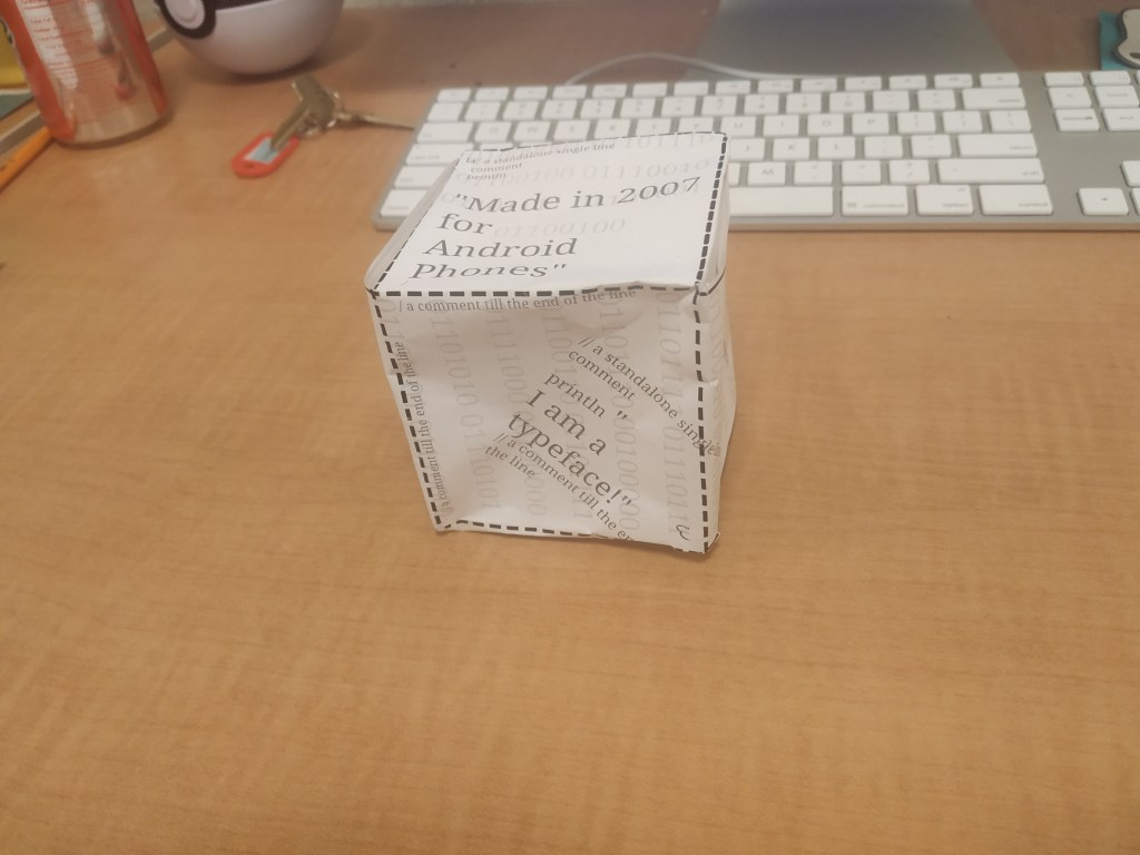
I decided to change up the text for the cube and focus more on the information about Droid. The typeface was created for Android devices in 2007. the creator, Steve Matteson is a typeface creator that works for Ascender.
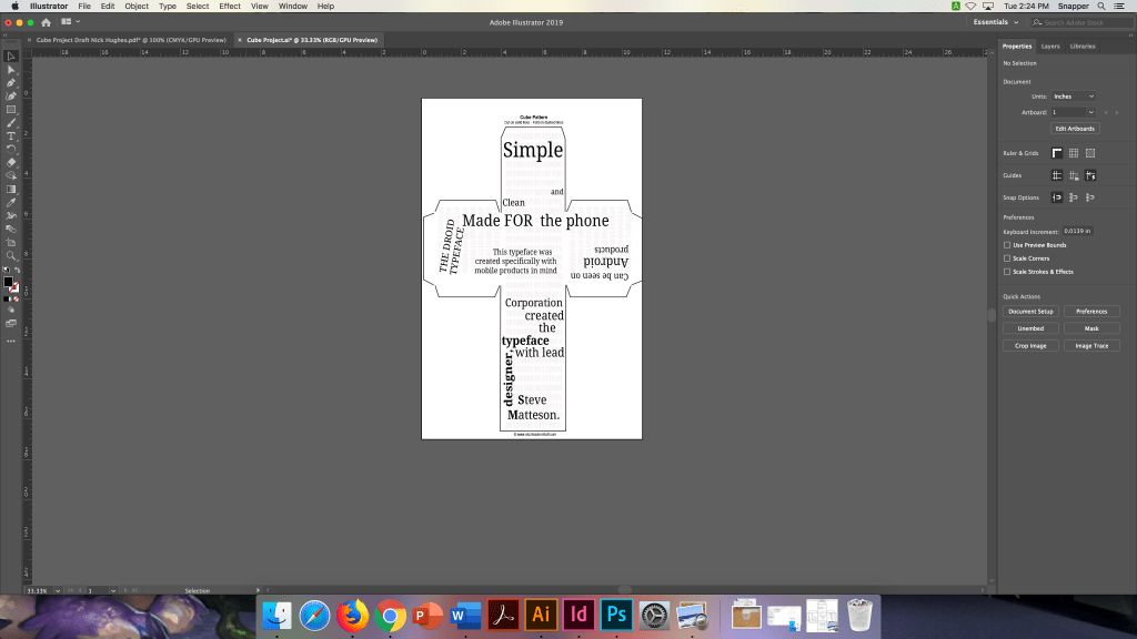
This is a more updated idea that I wanted for the cube. I was working on the project in the Snapper office and I thought to take out the purple at this point. It did not feel like it had anything to do with Droid.
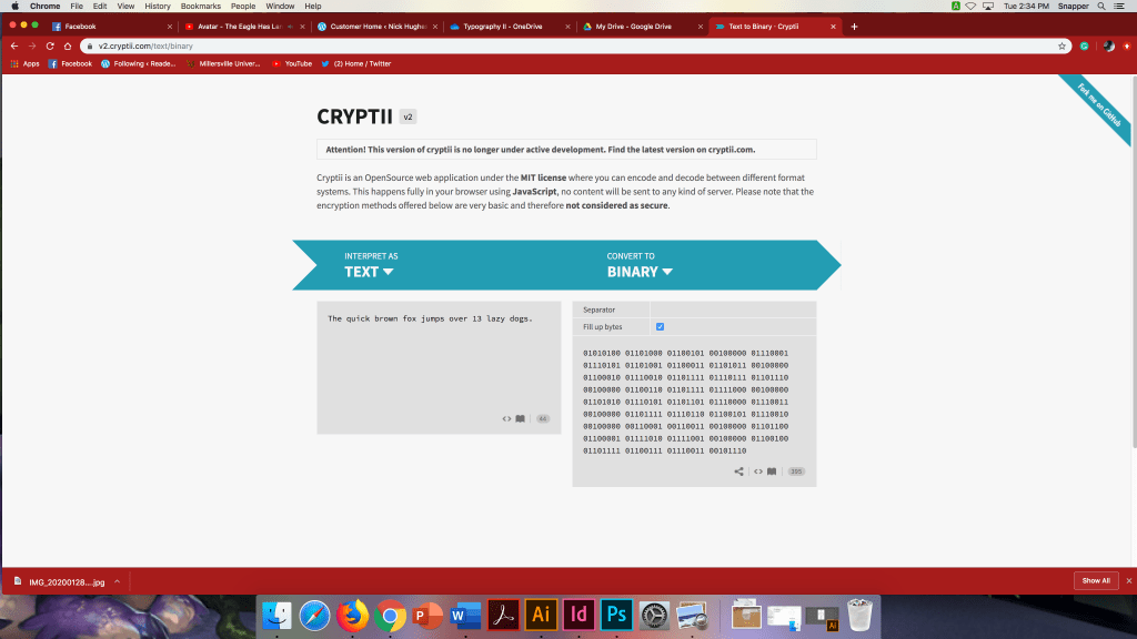
This photo features the faded text that is in the background of the sides of the cube. It is binary for The quick brown fox jumps over 13 lazy dogs. I thought it would look neat to show binary for the droid typeface.
I thought it would look cool due to the name droid. Binary is a droid-like language for me. I think it was cool to show the entire letter of the alphabet in binary.
This is the final picture that I designed. I hope that it works out well.
